
CSSアニメーションで遊んでみた
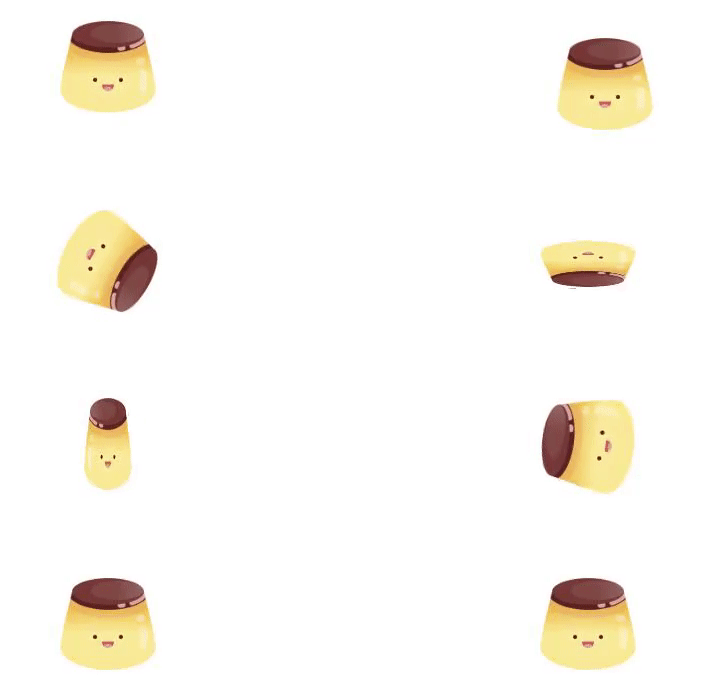
Gyazo Screen Video
gyazo.com
HTML
<!DOCTYPE html>
<html lang="ja">
<head>
  <meta charset="utf-8">
  <title>My Playground</title>
  <link rel="stylesheet" href="css/styles.css">
</head>
<body>
  <div class="container">
    <ul class="flex">
      <li class="item item-A">
        <img src="https://user-images.githubusercontent.com/50351871/165689726-79515a8c-c7cb-43ba-b530-9c464a78a557.png" width="100">
      </li>
      <li class="item item-B">
        <img src="https://user-images.githubusercontent.com/50351871/165689726-79515a8c-c7cb-43ba-b530-9c464a78a557.png" width="100">
      </li>
      <li class="item item-C">
        <img src="https://user-images.githubusercontent.com/50351871/165689726-79515a8c-c7cb-43ba-b530-9c464a78a557.png" width="100">
      </li>
      <li class="item item-D">
        <img src="https://user-images.githubusercontent.com/50351871/165689726-79515a8c-c7cb-43ba-b530-9c464a78a557.png" width="100">
      </li>
      <li class="item item-E">
        <img src="https://user-images.githubusercontent.com/50351871/165689726-79515a8c-c7cb-43ba-b530-9c464a78a557.png" width="100">
      </li>
      <li class="item item-F">
        <img src="https://user-images.githubusercontent.com/50351871/165689726-79515a8c-c7cb-43ba-b530-9c464a78a557.png" width="100">
      </li>
      <li class="item item-G">
        <img src="https://user-images.githubusercontent.com/50351871/165689726-79515a8c-c7cb-43ba-b530-9c464a78a557.png" width="100">
      </li>
      <li class="item item-H">
        <img src="https://user-images.githubusercontent.com/50351871/165689726-79515a8c-c7cb-43ba-b530-9c464a78a557.png" width="100">
      </li>
    </ul>
  </div>
</body>
</html>
CSS
* {
  box-sizing: border-box;
  margin: 0;
  padding: 0;
}

ul {
  list-style: none;
}

img {
  vertical-align: bottom;
}

.container {
  padding: 40px 0;
}

.flex {
  display: flex;
  flex-wrap: wrap;
}

.item {
  width: calc(100% / 2);
  text-align: center;
  margin-bottom: 80px;
}

.item-A {
  animation: upDown 4s infinite;
}

@keyframes upDown {
  0% {
    transform: translateY(0);
  }
  25% {
    transform: translateY(-40px);
  }
  100% {
    transform: translateY(0);
  }
}

.item-B {
  animation: sideMove 4s infinite;
}

@keyframes sideMove {
  0% {
    transform: translateX(0);
  }
  25% {
    transform: translateX(40px);
  }
  100% {
    transform: translateX(0);
  }
}

.item-C {
  animation: rotation 3s infinite linear;
}

@keyframes rotation {
  0% {
    transform: rotate(0);
  }
  100% {
    transform: rotate(360deg);
  }
}

.item-D {
  animation: rotation2 3s infinite linear;
}

@keyframes rotation2 {
  0% {
    transform: rotateX(0);
  }
  100% {
    transform: rotateX(360deg);
  }
}

.item-E {
  animation: rotation3 3s infinite linear;
}

@keyframes rotation3 {
  0% {
    transform: rotateY(0);
  }
  100% {
    transform: rotateY(360deg);
  }
}

.item-F {
  animation: rotation4 3s infinite ease-in-out alternate;
}

@keyframes rotation4 {
  0% {
    transform: rotate(0);
  }
  100% {
    transform: rotate(360deg);
  }
}

.item-G {
  animation: swing 2s infinite;
}

@keyframes swing {
  0% {
    transform: rotate(0);
  }
  55% {
    transform: rotate(0deg);
  }
  60% {
    transform: rotate(-10deg);
  }
  65% {
    transform: rotate(8deg);
  }
  70% {
    transform: rotate(-5deg);
  }
  75% {
    transform: rotate(4deg);
  }
  80% {
    transform: rotate(-3deg);
  }
  85% {
    transform: rotate(2deg);
  }
  90% {
    transform: rotate(-1deg);
  }
  95% {
    transform: rotate(1deg);
  }
  100% {
    transfrom: rotate(0);
  }
}

.item-H {
  animation: flash 2s ease-in-out infinite alternate;
}

@keyframes flash {
  0% {
    opacity: 0;
  }
  100% {
    opacity: 1;
  }
}